Spice Nirvana: A Journey Through Design and Branding
Introduction
Embarking on a voyage to redefine the essence of traditional Indian spices for a global palate, the Applied Design and Strategy Institute (ADSI), led by Amjad Osman and his creative team, took on the Spice Nirvana project. This initiative aimed to weave a new narrative around Chili Powder, Garam Masala, and Turmeric Powder, transforming their presentation into a celebration of heritage and contemporary elegance.
Project Vision
The ambition behind Spice Nirvana was to craft a brand that harmonizes the rich legacy of Indian spices with the aesthetics of the modern world. Through thoughtful design and storytelling, the goal was to make these spices not just ingredients but key players in a culinary tale that spans continents and cultures. This project sought to elevate the humble spices to objects of beauty and narratives, making them resonate with enthusiasts of culinary art worldwide.
Design and Branding Journey
Crafting the Brand Identity
Choosing the name “Spice Nirvana” was a deliberate step towards encapsulating the bliss and perfection achieved through culinary experiences. It was important that each spice—Chili Powder, Garam Masala, and Turmeric Powder—be celebrated for its individual story and contribution to flavor and health, bridging the gap between tradition and the desires of contemporary cooks.
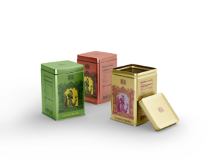
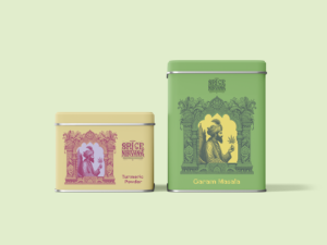
Packaging Design
The packaging design for Spice Nirvana was envisioned as a canvas that blends the vibrancy of Indian spices with a clean, modern aesthetic. Focusing on sustainable materials, the team committed to a design that respects the environment while offering a tactile and visually appealing experience to consumers. The design subtly incorporates elements of Indian heritage, using colors and patterns that reflect the spices’ warmth and earthiness, making the packaging not just protective but also informative and inviting.
The design also includes thoughtful features that enhance usability and preserve the spices’ freshness, ensuring that the quality of the experience inside matches the beauty of the exterior.
Visual Language
Developing a visual language for Spice Nirvana involved marrying traditional motifs with contemporary design principles. The result is a brand identity that feels both timeless and fresh, inviting curiosity and exploration. The color scheme draws from the natural colors of the spices themselves, grounding the brand in authenticity while employing modern typography and graphics to convey a sense of quality and care.
Reflections and Achievements
The introduction of Spice Nirvana has brought a new perspective to the spice market, inviting consumers to engage with Indian spices in a way that celebrates their cultural origins and their place in modern cuisine. The nuanced approach to design and branding has fostered a deeper connection between the product and its audience, highlighting the role of design in bringing stories to life.
Through this project, Spice Nirvana has become more than just a brand; it’s a bridge between the past and the present, offering a sensory journey that delights and educates. The thoughtful consideration of sustainability, coupled with a design that respects tradition while embracing modernity, has marked Spice Nirvana as a beacon of thoughtful culinary branding.
Conclusion
The Spice Nirvana project exemplifies ADSI’s gentle yet profound approach to design, where the subtlety of storytelling meets the elegance of visual expression. Under Amjad Osman’s direction, the team has crafted a brand that speaks softly but resonates deeply, illustrating how design can be a powerful conduit for culture, tradition, and innovation. Spice Nirvana stands as a testament to the beauty of blending worlds, inviting all to partake in the rich tapestry of flavors that define Indian culinary heritage.